Overview
How Do we build a stronger connection between parents and schools?
Effective communication is essential to create strong school-home partnerships and to increase parental involvement. However many families and teachers still struggle with establishing a strong connection due to lack of tools and busy schedules. That prompted me to spend time researching, designing, and developing High Five - A parent-teacher communication app that builds stronger connections between schools and families by connecting everyone and streamlining communication.
The Problem
The teacher and parents’ lack of communication or ineffective and inefficient communication is a major disadvantage in building a strong support system between the two parties. When schools use too many communication apps and platforms to send out notifications, forms, and messages, things get lost in the shuffle. Overloaded parents often don’t know what to respond to and where to get answers, leading to further confusion and frustration and worst of all, disengagement.
The Solution
Providing a platform for parents to stay well-informed about their children's progress at school and actively communicating with teachers has proven to encourage parents to contribute to a supportive and collaborative learning environment for their kids. The following features of the High Five help to address the problem of establishing a solid connection between teachers and parents and increasing parental involvement.
Discovery
Secondary Research
For my secondary research, I was mainly focused on the information regarding ineffective and inefficient communication between parents and teachers. Most communication barriers are categorized as either school-related or parent-related.
School-related obstacles are described as the inability to provide communication support, lack of system knowledge, and failure to develop alternative strategies. Parent-related ones are described as family status, pragmatic concerns (such as the non-flexibility of parents’ work hours, etc.), and psychological barriers (negative experiences about schools, etc.).
Primary Research
To get insight as to how people communicate with their child’s teacher and what are the pain points, I utilized screener surveys on social media platforms to recruit participants to interview and received 16 valuable feedback.
The screener survey allowed me to identify the participants who have the characteristics was looking for:
✔ A parent of a child in an elementary school. (6-12yr old)
✔ Wants better communication with their child’s teacher.
✔ Expressed interest in improving current communication methods.
✔ Experienced problems with communicating with their child’s teacher.
After gathering and synthesizing the findings, I was then able to create affinity groups, empathy maps, and personas.
User Interviews
I virtually interviewed 5 people via Zoom, who are parents to elementary school kids, who are also experiencing difficulty or wanting to improve their communication with their child’s teacher. The findings from the interview helped answer my assumption to those questions and shape my direction in designing the application. Some of the questions that provided the most useful pieces of information are:
➊ How do you communicate with your child’s teachers?
➋ How was your experience in communicating with the teacher?
➌ What are the challenges/barriers that you face when trying to connect?
Affinity Map
I synthesized the qualitative data gathered from user interviews and created both affinity and empathy maps to help me better visualize the information. By identifying the behavior pattern and shared themes among the interviewees, I was able to group similar responses into an affinity map and narrow it down to five main categories: which included
➊ Stressors and pain points
Participants shared their concerns and pain points regarding current ways of communication with their child's teachers. They expressed that their preferred way of communication is talking to the teacher via phone call or in-person to be more direct and clear about the situation.
➋ Motivation/reasons to communicate
Participants elaborated on their reasons behind reaching out to their children's teachers mostly concerning how their children are doing at school, and collaborating with the teachers regarding the children's homework and behavior.
➌ Ways to communicate
Participants shared an overwhelming need to streamline and improve their communication tools with their child's teachers. They hope for more than just an email and phone exchange; an opportunity to see more about their child's experience.
➍ Want to see more regarding communication and school
Participants shared their views on hoping to see more school/event photos so they feel more involved in their children's lives. And also the option to make an appointment with the teachers for a more in-depth conversation.
➎ Feel good elements when communicating
Participants were delighted when having the opportunity to communicate with their children's teacher in person and discuss how the child is doing at school, they also expressed reassurance when both parties are constantly following up with the children's process.
Empathy Map
With the information organized from the affinity map, I created the empathy map to provide deeper insights into the users. I identified two unique types of users for the High Five app. Each user type had specific needs, motivations, and pain points, which I kept coming back to during my design process to ensure the users’ needs were being met.
The "Enthusiastically Involved" Parent
The "I Care but I don’t have time to" Parent
User Persona
After identifying the 2 distinct types of users, as well as their goals and needs, I developed user personas to represent key audience segments. It helps me focus on tackling the most important problems – to address the major needs of the users.
Ideation
How Might We...
I created How Might We (HMW) problem statements to frame the ideation in the brainstorming session for solutions. These questions are generated based on the insights and needs I gathered in my Empathy Map. They also communicate the right problems users want solved.
✔ How might we assist in encouraging conversation between parents and teachers with the restriction of time?
✔ How might we assist parents in finding information about school events, due dates, and how their kids are doing at school?
✔How might we encourage parents to be more involved in their kid’s school life and establish open communication with teachers?
✔ How might we help to make parents feel more confident in their parenting style and build a strong relationship between the school, their kids, and themselves?
Brainstorm
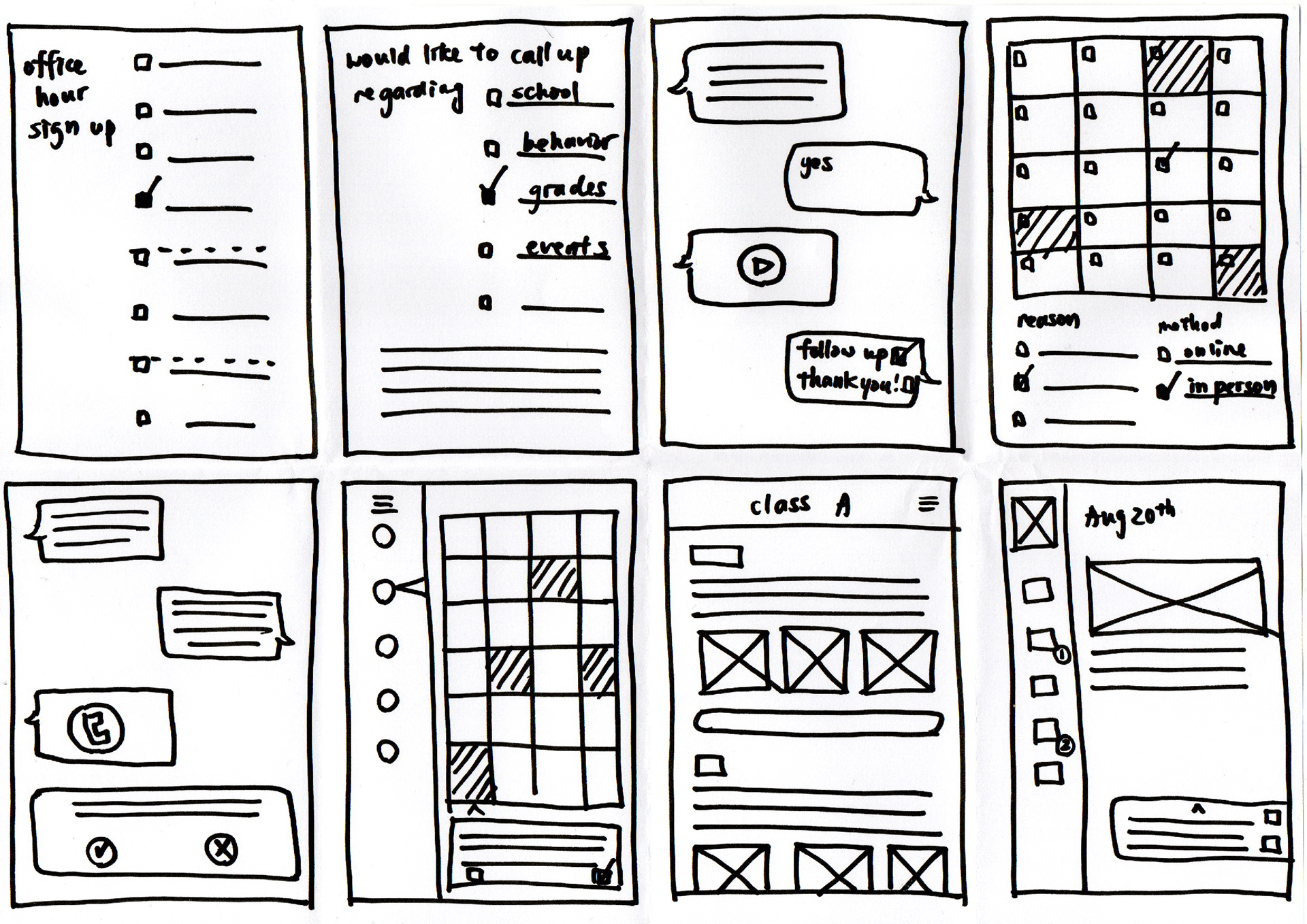
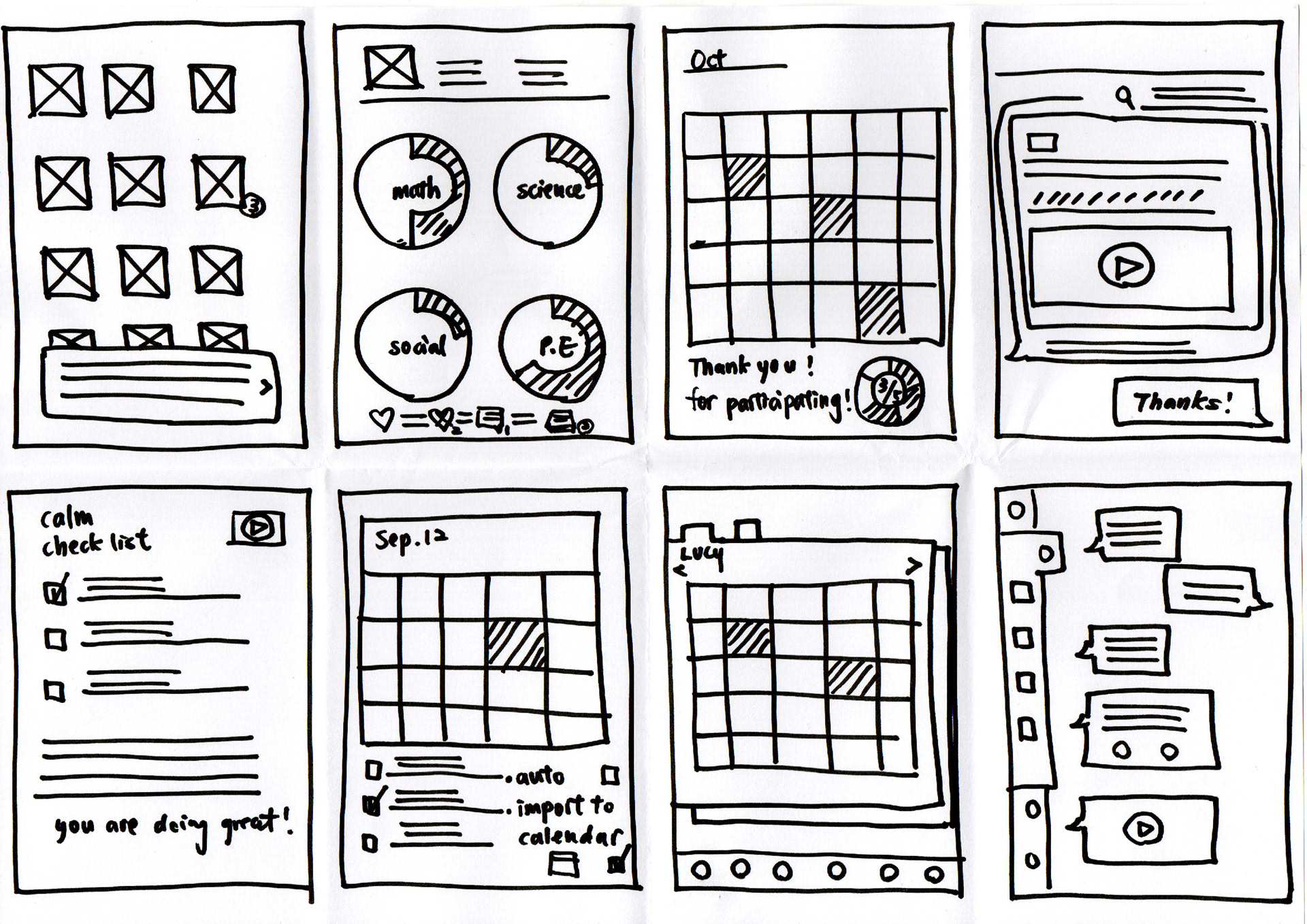
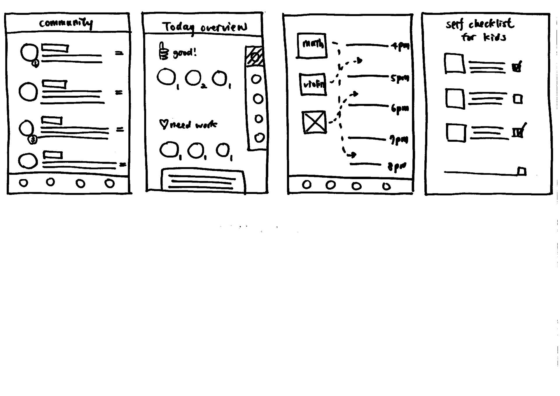
After focusing on HMWs, it’s time to explore different concepts and come up with as many ideas as possible. Not focusing on a perfect solution, but rather understanding the problem is the key. This helped me quickly bring out all the possible solutions for the problem statements, and dive deeper into their potential.
User Stories
User stories help me with putting users in the center of the conversation and prioritizing the most important functions the High Five app needs.
As a user, I want to:
✔ I want to check the availability of the teacher’s office hours so I can sign up for a meeting.
✔ I want to scroll through class pages with daily recordings of school work so I can stay informed of my kid’s classroom activities through pictures and stories.
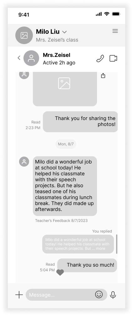
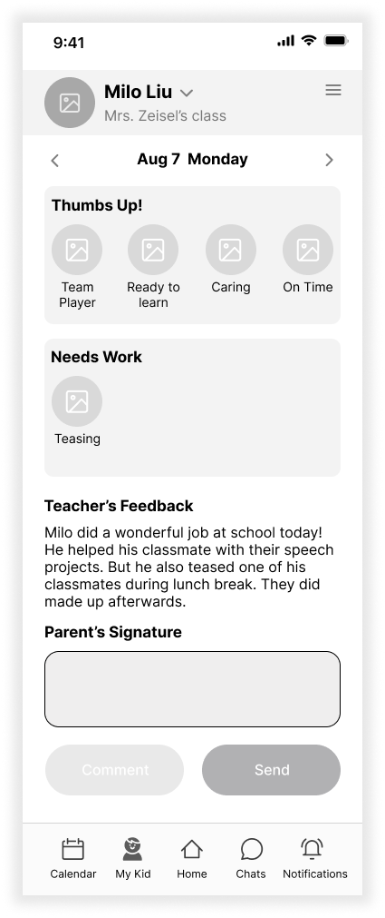
✔ I want to send feedback to the teacher's comments about my kids so I can show that I’m going to follow up with the comments and express my concerns.
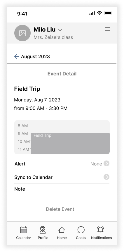
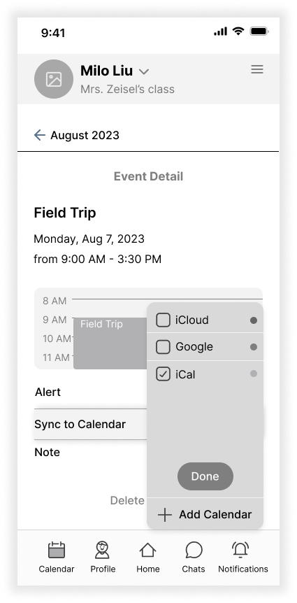
✔ I want to be able to sync my kid's school work due date to my calendar so I can manage the after-school schedule in my app of choice.
✔ I want to check my kid’s class calendars for future events so I can be more prepared and make time for them.
Site Map
After defining the product goals and the most prominent features the user needed, I started building up the structure of High Five using the site map. The sitemap helps me visualize the relationship between the content and makes sure the features and functions are aligned with the user’s expectations.
User Flow
After having a clear picture of what the structure of the application looks like, I chose three essential red routes that were used most frequently and were vital to the app. These three user flows map out scenarios that correspond to the established tasks.
➊ Sign up for a time slot to meet with my child’s teacher
➋ Reply to the teacher’s comments on my child’s behavior
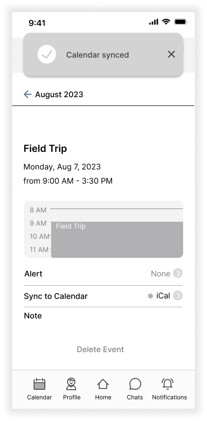
➌ Sync a future event to my calendar
Sketches
Sketching helped me visualize the user experience and put the user flows into perspective. With pen and paper, I captured my ideas quickly without worrying about being pixel-perfect in digitizing them. I wanted the experience to be intuitive with a sense of humor and caring.
Design
Wireframes
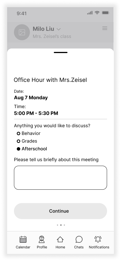
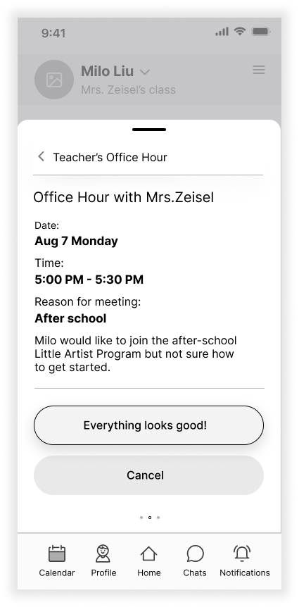
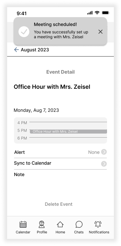
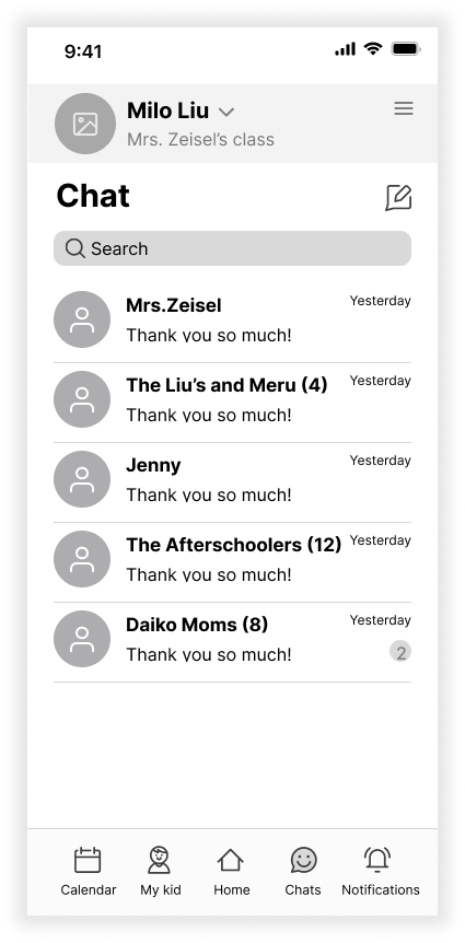
After having a visual direction of the layout, I began working in Figma to digitize the sketches and turn them into mid-fidelity wireframes. Doing so helped me clarify the spacing between contents and prioritize functions with visual hierarchy.
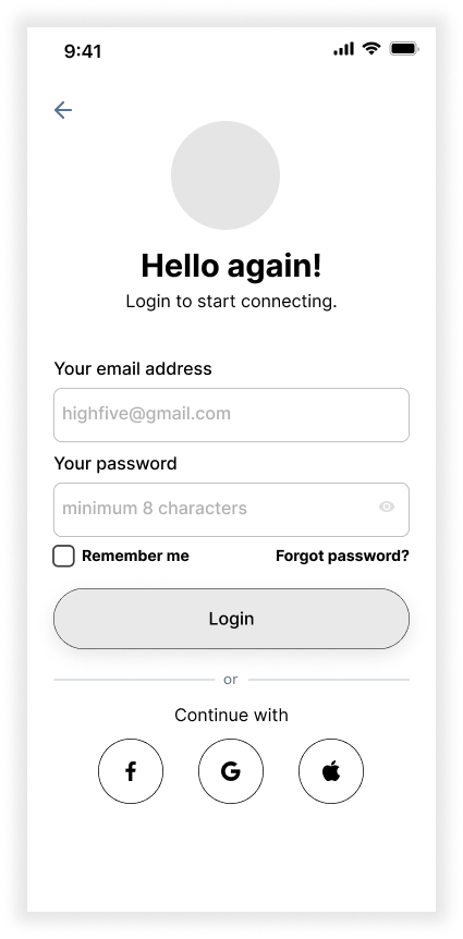
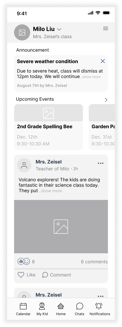
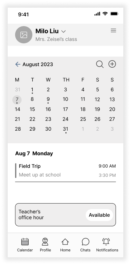
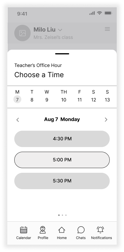
Brand Platform and Mood Board
From the concept and functionality of this application, I want to give the users a delightful and genuine experience, as if the application is a reliable friend, guiding users through a journey of understanding and building connections.
For UI inspiration, I chose these images and illustrations because they look friendly, inviting, and trustworthy which is critical to a parent-teacher communication platform. The UI for the High Five App should be simple and soft without complicated colors and shapes because a brighter and simpler UI will feel gentle and easier to navigate.
Style Guide
I further developed the visual style of the application to keep a consistent design language throughout the app and make sure the design system is aligned with the look and feel of the High Five brand attributes: Friendly, caring, effortless, reliable, and delightful. I learned how essential it is to keep a cohesive and unified UI so the app is intuitive to the users. I used blue to establish a professional and trustworthy tone for the app and used warm tones for the accent to embrace and delight the users.
High-Fidelity Wireframe
I created high-fidelity wireframes by applying established styles and focused on the user experience being intuitive and delightful. There were many iterations made along the way allowing me to examine the aesthetic feeling and to better align with the brand.
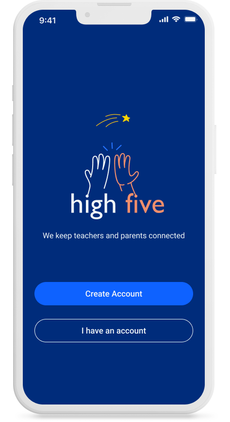
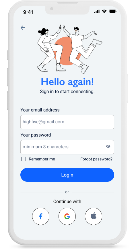
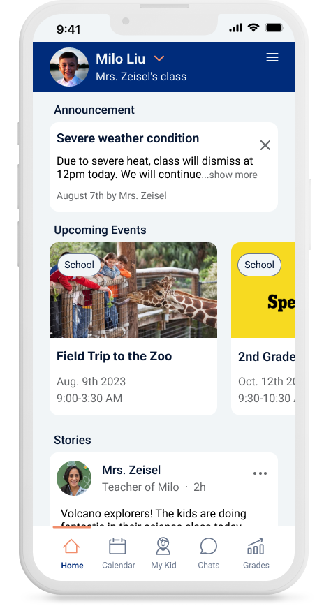
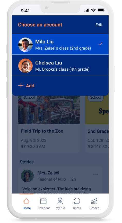
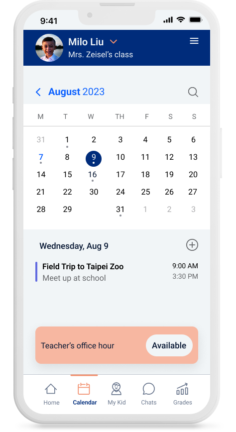
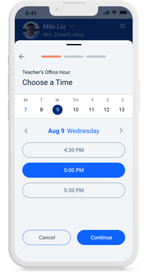
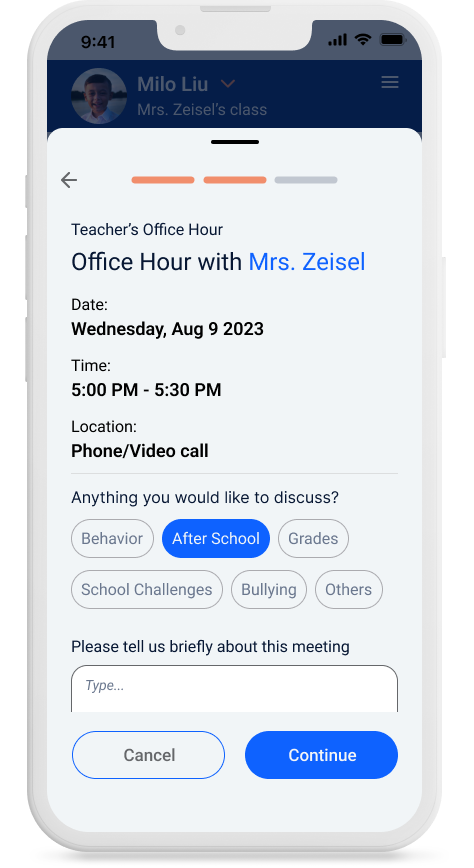
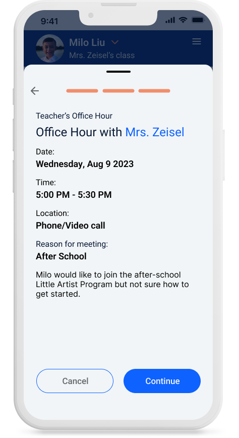
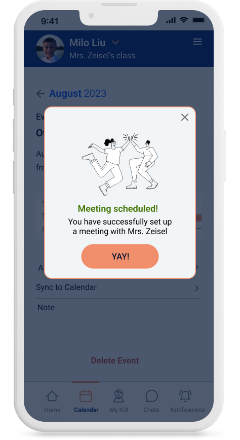
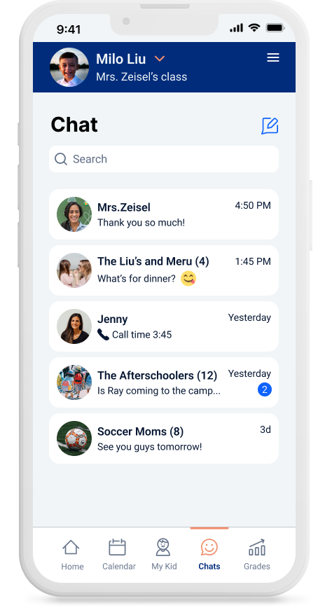
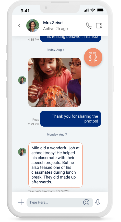
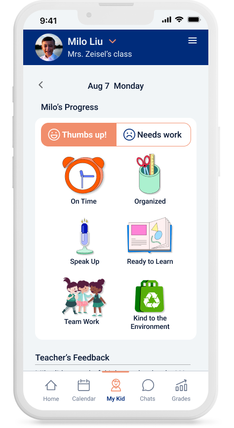
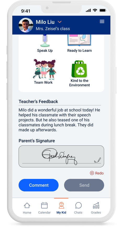
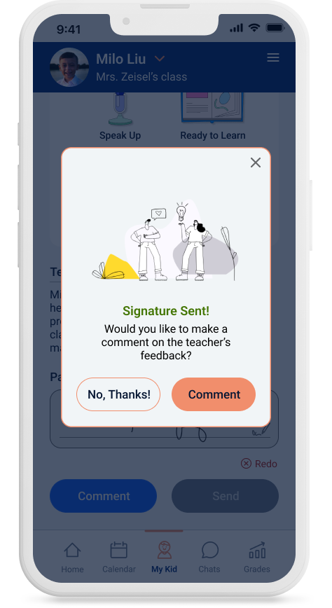
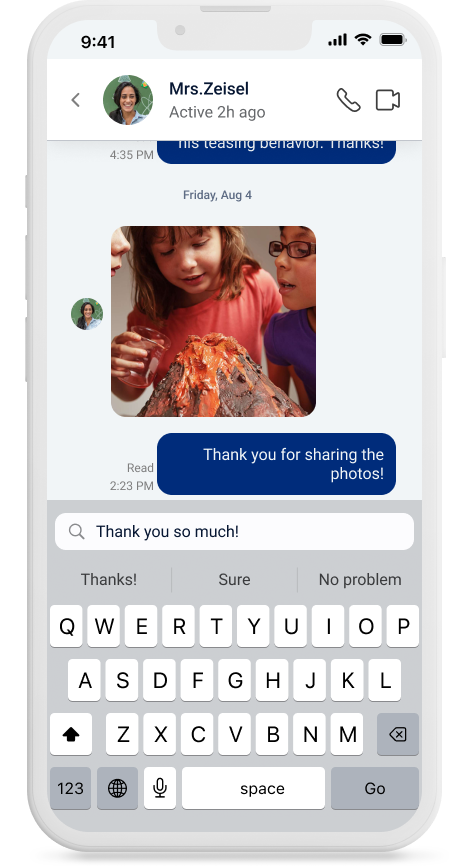
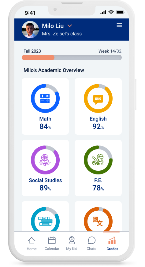
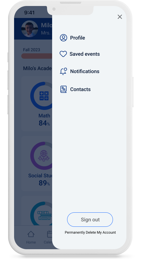
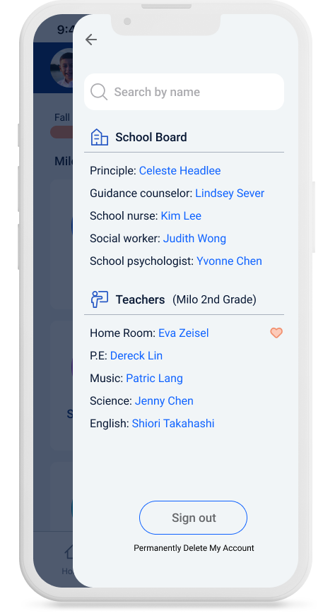
I used Figma to develop a prototype of my red routes and run tests to uncover any potential usability issues. I’ve also discovered missing screens and steps within the user flows. Through many iterations, I continued to make adjustments and improvements to further complete the application for a smooth user experience.
Testing
Usability Testing
For the high fidelity App’s usability testing, I wanted to not only uncover any usability issues that would prevent users from easily using the application but to evaluate the design and graphics as well as how users interpreted them throughout the app. All 5 participants had previously taken the screener survey and were reached out to conduct the remote moderated usability testing.
Task
➊ Find the teacher’s office hour availability and sign up for a time slot to meet with my child's teacher
➋ View and reply to the teacher’s comments on my child’s daily behavior.
➌ Sync a future event to my calendar
Redesign
After gathering all participants' feedback I was then able to redesign to arrive at my final UI design.
Reflection
Usability Testing
With the final prototype created, I believe I have met the goals that were outlined at the beginning of the design process. I designed a mobile app to encourage parent-teacher communication and transition connecting with school into a delightful experience. There’s room for more design iteration and nice-to-have features, but I’m happy with the development.
Through the development of this project, I’ve gained a vast amount of knowledge, insight, and appreciation from the interviews, research, and actual design work. I started to pay attention to all the applications and products I was experiencing and noticed the thought process and hard work that went into building them. I also would take notes and try to incorporate those really exciting interactions and designs for future reference in my project.
I’ve also learned to properly conduct an interview and listen to the users to achieve a higher understanding of who I was designing for. Being a parent and also a teacher gave me the privilege of having some insights into both worlds and recruiting interviewees for this project. But while I dive deep into creating the visuals, I need to step back and prioritize the needs of the app's users.
As an industrial designer turned mom, turned teacher and now loving every step of the way to become a UIUX designer, I learned that the journey is the destination, design is an ongoing process, and the users always come first.